



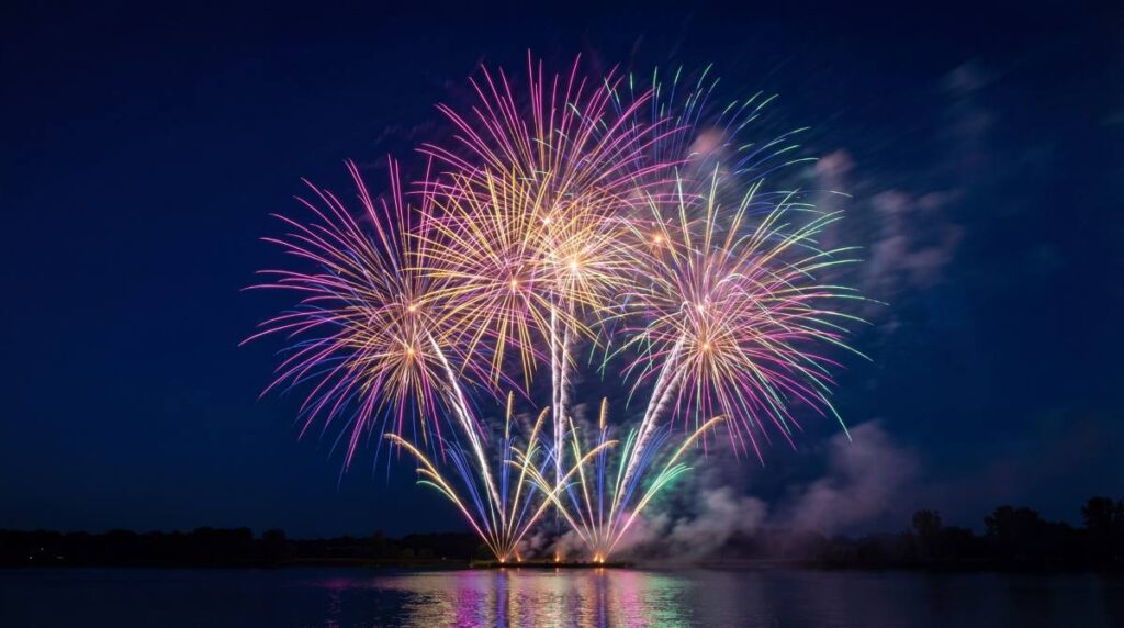
A great fireworks display is about more than simply choosing the biggest or loudest fireworks available. Some of the most memorable displays are carefully planned around colour, using combinations that complement one another, create contrast, and guide the audience through a visual journey.
Professional display designers spend a great deal of time considering colour palettes because different colours evoke different emotions and create different effects in the night sky. A well-planned sequence of colours can make a display feel elegant, dramatic, patriotic, festive, or even romantic.
Whether you’re planning a Bonfire Night celebration, a wedding display, a New Year’s Eve event, or a community fireworks show, understanding colour combinations can help you create a much more impressive experience.
In this guide, we’ll explore some of the best colour combinations for fireworks displays and why they work so effectively.
Why Colour Matters in Fireworks
Colour is one of the first things people notice when watching fireworks. Bright bursts of red, gold, blue, and green naturally capture attention, but the way colours interact with one another is what creates truly memorable displays.
Good colour selection can:
- Create visual contrast
- Establish a theme or mood
- Build excitement throughout a display
- Improve visibility in the night sky
- Make photographs and videos more striking
Rather than treating each firework as a separate effect, thinking about colours as part of an overall display can help create a more cohesive and professional-looking show.
Understanding Firework Colours
Before looking at specific combinations, it helps to understand where firework colours come from.
The science behind how different firework colours are created involves various metal compounds that produce specific colours when heated. Different elements generate different visual effects, allowing manufacturers to create everything from deep reds and vibrant greens to rich blues and brilliant golds.
This scientific precision is what gives modern fireworks their incredible variety and allows display designers to create carefully coordinated colour sequences.
Gold and Red: The Classic Combination
Few colour pairings are as timeless as gold and red.
Gold creates a rich, elegant backdrop, while red adds energy and intensity. Together they create a display that feels warm, celebratory, and dramatic.
This combination works particularly well for:
- Bonfire Night
- New Year’s Eve
- Anniversary celebrations
- Community displays
Gold effects often linger in the sky longer than other colours, allowing red bursts to stand out against a shimmering background.
The result is a display that feels both traditional and spectacular.
Blue and Silver: Cool and Sophisticated
For a more modern and refined aesthetic, blue and silver are an excellent choice.
Blue is one of the most difficult colours to produce in fireworks, making it particularly striking when executed well. Silver complements blue beautifully by adding brightness and contrast without overwhelming the display.
This combination is often used for:
- Corporate events
- Winter celebrations
- Formal occasions
- Contemporary displays
The cool tones create an elegant atmosphere that feels very different from the warmth of red and gold.
Purple and Gold: Luxury and Drama
Purple is often associated with royalty, creativity, and luxury. When paired with gold, it creates a display that feels rich and theatrical.
The contrast between the deep tones of purple and the brilliance of gold creates strong visual impact, particularly in darker night skies.
This combination works well for:
- Weddings
- Gala events
- Milestone celebrations
- Premium displays
Because purple is less commonly seen than red or green, it often surprises audiences and helps displays stand out.
Red, White, and Blue: Patriotic Themes
Many national celebrations utilise combinations of red, white, and blue.
The strong contrast between these colours makes them highly visible, while the combination itself often carries symbolic significance.
These displays work particularly well when colours are fired in coordinated sequences rather than all at once.
Layering the colours can create depth while maintaining a clear visual theme throughout the display.
Green and Gold: Natural Elegance
Green and gold create a softer, more natural-looking display.
The combination often evokes themes of nature, prosperity, and celebration. Green provides freshness and vibrancy, while gold adds warmth and sophistication.
This pairing is particularly effective for:
- Outdoor festivals
- Summer events
- Garden displays
- Community celebrations
Because both colours are highly visible, they maintain their impact even from longer viewing distances.
Blue and Gold: Striking Contrast
Blue and gold sit on opposite ends of the visual spectrum in terms of temperature.
The coolness of blue and the warmth of gold create a striking balance that feels both exciting and harmonious.
This combination is often favoured by display designers because it provides strong contrast without appearing chaotic.
It works well for:
- Large public displays
- Sporting celebrations
- Corporate events
- New Year’s celebrations
The colours naturally draw attention to one another, making each burst appear more vivid.
Pink and Silver: Romantic Displays
For weddings and romantic celebrations, pink and silver are a popular choice.
Pink provides softness and warmth, while silver adds sparkle and elegance.
This combination creates a light, celebratory atmosphere without relying on overly bold colours.
It works particularly well for:
- Weddings
- Engagement parties
- Anniversary celebrations
- Gender reveal events
The combination also photographs exceptionally well, making it a favourite among event planners.
Multi-Colour Rainbow Displays

Sometimes the goal isn’t elegance or simplicity but pure excitement.
Rainbow-style displays combine multiple colours to create a fast-paced, energetic experience.
These displays often feature:
- Red
- Blue
- Green
- Purple
- Gold
- Silver
The challenge with multi-colour displays is maintaining balance. Too many colours fired simultaneously can appear cluttered.
Professional displays often achieve better results by introducing colours gradually, allowing each effect to be appreciated before transitioning to the next.
Monochromatic Displays
While contrast is important, some of the most sophisticated displays use variations of a single colour.
For example:
- Gold with different effects and durations
- Multiple shades of blue
- Silver-focused displays
- Layered red sequences
Monochromatic displays create a strong visual identity and can feel surprisingly dramatic when executed well.
They are particularly effective when combined with music or choreographed sequences.
Colour Combinations for Different Occasions
Different events often benefit from different colour palettes.
Bonfire Night
Popular combinations include:
- Gold and red
- Gold and green
- Red and silver
These colours complement the warm atmosphere of autumn evenings.
New Year’s Eve
Common choices include:
- Gold and silver
- Blue and silver
- Multi-colour finales
These combinations create a festive and celebratory feel.
Weddings
Elegant palettes often feature:
- Pink and silver
- Purple and gold
- White and gold
These colours help create a romantic atmosphere.
Community Events
Displays designed for broad audiences often utilise:
- Rainbow colour schemes
- Red and gold
- Blue and gold
These combinations appeal to a wide range of spectators and maximise visual impact.
Using Colour to Build a Display
The best displays don’t simply fire random colours into the sky.
Instead, they often follow a progression:
- Opening with softer colours
- Building towards stronger contrasts
- Introducing larger bursts and brighter tones
- Finishing with an intense multi-colour finale
This structure creates a sense of journey and keeps audiences engaged throughout the display.
Colour becomes part of the storytelling rather than simply decoration.
Choosing Fireworks with Colour in Mind
When selecting fireworks, it’s worth looking beyond size and noise level.
Pay attention to:
- Dominant colours
- Effect duration
- Burst size
- Sequence timing
- Overall display theme
You can shop fireworks and celebration supplies with Anfield Fireworks. We’ll help you select products that work well together, ensuring colour combinations complement one another rather than compete for attention.
Whether you’re planning a small garden celebration or a larger event, taking colour into account can dramatically improve the final result.
Creating a Display That Stays in People’s Memories
The most successful fireworks displays are often the ones that feel thoughtfully designed. While loud effects and large bursts certainly grab attention, colour is what gives a display personality.
With a strategic combination of colours, you can create mood, excitement, elegance, or drama depending on the occasion.
Whether you favour classic gold and red, sophisticated blue and silver, or vibrant rainbow effects, understanding colour combinations allows you to get more from every firework.
The next time you plan a display, think about the colours as carefully as the fireworks themselves. A little planning can transform a collection of individual effects into a truly unforgettable experience.

